[Big Data, Data Mining, Open source, Python] Crime, Race and Lethal Force in the USA — Part 2 (перевод)
Автор
Сообщение
news_bot ®
Стаж: 7 лет 11 месяцев
Сообщений: 27286

In the previous part of this article, I talked about the research background, goals, assumptions, source data, and used tools. Today, without further ado, let's say together…
Chocks Away!
We start by importing the required packages and defining the root folder where the source data sit:
import pandas as pd, numpy as np
# root folder path (change for your own!)
ROOT_FOLDER = r'c:\_PROG_\Projects\us_crimes'
Lethal Force Fatalities
First let's look into the use of lethal force data. Load the CSV into a new DataFrame:
# FENC source CSV
FENC_FILE = ROOT_FOLDER + '\\fatal_enc_db.csv'
# read to DataFrame
df_fenc = pd.read_csv(FENC_FILE, sep=';', header=0, usecols=["Date (Year)", "Subject's race with imputations", "Cause of death", "Intentional Use of Force (Developing)", "Location of death (state)"])
You will note that not all the fields are loaded, but only those we'll need in the research: year, victim race (with imputations), cause of death (not used now but may come in useful later on), intentional use of force flag, and the state where the death took place.
It's worth understanding what «subject's race with imputations» means. The fact is, the official / media sources that FENC uses to glean data don't always report the victim's race, resulting in data gaps. To compensate these gaps, the FENC community involves third-party experts who estimate the race by the other available data (with some degree of error). You can read more on this on the FENC website or see notes in the original Excel spreadsheet (sheet 2).
We'll then give the columns handier titles and drop the rows with missing data:
df_fenc.columns = ['Race', 'State', 'Cause', 'UOF', 'Year']
df_fenc.dropna(inplace=True)
Now we hava to unify the race categories with those used in the crime and population datasets we are going to match with, since these datasets use somewhat different racial classifications. The FENC database, for one, singles out the Hispanic/Latino ethnicity, as well as Asian/Pacific Islanders and Middle Easterns. But in this research, we're focusing on Blacks and Whites only. So we must make some aggregation / renaming:
df_fenc = df_fenc.replace({'Race': {'European-American/White': 'White',
'African-American/Black': 'Black',
'Hispanic/Latino': 'White', 'Native American/Alaskan': 'American Indian',
'Asian/Pacific Islander': 'Asian', 'Middle Eastern': 'Asian',
'NA': 'Unknown', 'Race unspecified': 'Unknown'}}, value=None)
We are leaving only White (now including Hispanic/Latino) and Black victims:
df_fenc = df_fenc.loc[df_fenc['Race'].isin(['White', 'Black'])]
What's the purpose of the UOF (Use Of Force) field? For this research, we want to analyze only those cases when the police (or other law enforcement agencies) intentionally used lethal force. We leave out cases when the death was the result of suicide (for example, when sieged by the police) or pursuit and crash in a vehicle. This constraint follows from two criteria:
1) the circumstances of deaths not directly resulting from use of force don't normally allow of a transparent cause-and-effect link between the acts of the law enforcement officers and the ensuing death (one example could be when a man dies from a heart attack when held at gun-point by a police officer; another common example is when a suspect being arrested shoots him/herself in the head);
2) it is only intentional use of force that counts in official statistics; thus, for instance, the future FBI database I mentioned in the previous part of the article will collect only such cases.
So to leave only intentional use of force cases:
df_fenc = df_fenc.loc[df_fenc['UOF'].isin(['Deadly force', 'Intentional use of force'])]
For convenience we'll add the full state names. I made a separate CSV file for that purpose, which we're now merging with our data:
df_state_names = pd.read_csv(ROOT_FOLDER + '\\us_states.csv', sep=';', header=0)
df_fenc = df_fenc.merge(df_state_names, how='inner', left_on='State', right_on='state_abbr')
Type df_fenc.head() to peek at the resulting dataset:
Race
State
Cause
UOF
Year
state_name
state_abbr
0
Black
GA
Gunshot
Deadly force
2000
Georgia
GA
1
Black
GA
Gunshot
Deadly force
2000
Georgia
GA
2
Black
GA
Gunshot
Deadly force
2000
Georgia
GA
3
Black
GA
Gunshot
Deadly force
2000
Georgia
GA
4
Black
GA
Gunshot
Deadly force
2000
Georgia
GA
Since we're not going to investigate the individual cases, let's aggregate the data by years and victim races:
# group by year and race
ds_fenc_agg = df_fenc.groupby(['Year', 'Race']).count()['Cause']
df_fenc_agg = ds_fenc_agg.unstack(level=1)
# cast numericals to UINT16 to save memory
df_fenc_agg = df_fenc_agg.astype('uint16')
The resulting table is indexed by years (2000 — 2020) and contains two columns: 'White' (number of white victims) and 'Black' (number of black victims). Let's take a look at the corresponding plot:
plt = df_fenc_agg.plot(xticks=df_fenc_agg.index, color=['olive', 'g'])
plt.set_xticklabels(df_fenc_agg.index, rotation='vertical')
plt.set_xlabel('')
plt.set_ylabel('Number of police victims')
plt
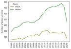
Intermediate conclusion:
White police victims outnumber black victims in absolute figures.
The average difference factor between the two is about 2.4. It's not a far guess that this is due to the difference between the population of the two races in the US. Well, let's look at per capita values then.
Load the population data:
# population CSV file (1991 - 2018 data points)
POP_FILE = ROOT_FOLDER + '\\us_pop_1991-2018.csv'
df_pop = pd.read_csv(POP_FILE, index_col=0, dtype='int64')
Then merge the data with our dataset:
# take only Black and White population for 2000 - 2018
df_pop = df_pop.loc[2000:2018, ['White_pop', 'Black_pop']]
# join dataframes and drop rows with missing values
df_fenc_agg = df_fenc_agg.join(df_pop)
df_fenc_agg.dropna(inplace=True)
# cast population numbers to integer type
df_fenc_agg = df_fenc_agg.astype({'White_pop': 'uint32', 'Black_pop': 'uint32'})
OK. Finally, create two new columns with per capita (per million) values dividing the abosulte victim counts by the respective race population and multiplying by one million:
df_fenc_agg['White_promln'] = df_fenc_agg['White'] * 1e6 / df_fenc_agg['White_pop']
df_fenc_agg['Black_promln'] = df_fenc_agg['Black'] * 1e6 / df_fenc_agg['Black_pop']
Let's see what we get:
Black
White
White_pop
Black_pop
White_promln
Black_promln
Year
2000
148
291
218756353
35410436
1.330247
4.179559
2001
158
353
219843871
35758783
1.605685
4.418495
2002
161
363
220931389
36107130
1.643044
4.458953
2003
179
388
222018906
36455476
1.747599
4.910099
2004
157
435
223106424
36803823
1.949742
4.265861
2005
181
452
224193942
37152170
2.016112
4.871855
2006
212
460
225281460
37500517
2.041890
5.653255
2007
219
449
226368978
37848864
1.983487
5.786171
2008
213
442
227456495
38197211
1.943229
5.576323
2009
249
478
228544013
38545558
2.091501
6.459888
2010
219
506
229397472
38874625
2.205778
5.633495
2011
290
577
230838975
39189528
2.499578
7.399936
2012
302
632
231992377
39623138
2.724227
7.621809
2013
310
693
232969901
39919371
2.974633
7.765653
2014
264
704
233963128
40379066
3.009021
6.538041
2015
272
729
234940100
40695277
3.102919
6.683822
2016
269
723
234644039
40893369
3.081263
6.578084
2017
265
743
235507457
41393491
3.154889
6.401973
2018
265
775
236173020
41617764
3.281493
6.367473
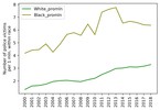
The two rightmost columns now contain per million victim counts for both races. Time to visualize that:
plt = df_fenc_agg.loc[:, ['White_promln', 'Black_promln']].plot(xticks=df_fenc_agg.index, color=['g', 'olive'])
plt.set_xticklabels(df_fenc_agg.index, rotation='vertical')
plt.set_xlabel('')
plt.set_ylabel('Number of police victims\nper 1 mln. within race')
plt
We'll also display the basic stats for this data by running:
df_fenc_agg.loc[:, ['White_promln', 'Black_promln']].describe()
White_promln
Black_promln
count
19.000000
19.000000
mean
2.336123
5.872145
std
0.615133
1.133677
min
1.330247
4.179559
25%
1.946485
4.890977
50%
2.091501
5.786171
75%
2.991827
6.558062
max
3.281493
7.765653
Intermediate conclusions:
- Lethal force results on average in 5.9 per one million Black deaths and 2.3 per one million White deaths (Black victim count is 2.6 greater in unit values).
- Data deviation (scatter) for Blacks is 1.8 higher than for Whites — you can see that the green curve representing White victims is considerably smoother.
- Black victims peaked in 2013 at 7.7 per million; White victims peaked in 2018 at 3.3 per million.
- White victims grow continuously from year to year (by 0.1 — 0.2 per million on average), while Black victims rolled back to their 2009 level after a climax in 2011 — 2013.
Thus, we can answer our first question:
— Can one say the police kill Blacks more frequently than Whites?
— Yes, it is a correct inference. Blacks are 2.6 times more likely to meet death by the hands of law enforcement agencies than Whites.
Bearing in mind this inference, let's go ahead and look at the crime data to see if (and how) they are related to lethal force fatalities and races.
Crime Data
Let's load our crime CSV:
CRIMES_FILE = ROOT_FOLDER + '\\culprits_victims.csv'
df_crimes = pd.read_csv(CRIMES_FILE, sep=';', header=0,
index_col=0, usecols=['Year', 'Offense', 'Offender/Victim', 'White',
'White pro capita', 'Black', 'Black pro capita'])
Again, as before, we're using only the relevant fields: year, offense type, offender / victim classifier and offense counts for each race (absolute — 'White', 'Black' and per capita — 'White pro capita', 'Black pro capita').
Let's look what we have here (with df_crimes.head()):
Offense
Offender/Victim
Black
White
Black pro capita
White pro capita
Year
1991
All Offenses
Offender
490
598
1.518188e-05
2.861673e-06
1991
All Offenses
Offender
4
4
1.239337e-07
1.914160e-08
1991
All Offenses
Offender
508
122
1.573958e-05
5.838195e-07
1991
All Offenses
Offender
155
176
4.802432e-06
8.422314e-07
1991
All Offenses
Offender
13
19
4.027846e-07
9.092270e-08
We won't need data on offense victims so far, so get rid of them:
# leave only offenders
df_crimes1 = df_crimes.loc[df_crimes['Offender/Victim'] == 'Offender']
# leave only 2000 - 2018 data years and remove redundant columns
df_crimes1 = df_crimes1.loc[2000:2018, ['Offense', 'White', 'White pro capita', 'Black', 'Black pro capita']]
Here's the resulting dataset (1295 rows * 5 columns):
Offense
White
White pro capita
Black
Black pro capita
Year
2000
All Offenses
679
0.000003
651
0.000018
2000
All Offenses
11458
0.000052
30199
0.000853
2000
All Offenses
4439
0.000020
3188
0.000090
2000
All Offenses
10481
0.000048
5153
0.000146
2000
All Offenses
746
0.000003
63
0.000002
...
...
...
...
...
...
2018
Larceny Theft Offenses
1961
0.000008
1669
0.000040
2018
Larceny Theft Offenses
48616
0.000206
30048
0.000722
2018
Drugs Narcotic Offenses
555974
0.002354
223398
0.005368
2018
Drugs Narcotic Offenses
305052
0.001292
63785
0.001533
2018
Weapon Law Violation
70034
0.000297
58353
0.001402
Now we need to convert the per capita (per 1 person) values to per million values (in keeping with the unit data we use throughout the research). Just multiply the per capita columns by one million:
df_crimes1['White_promln'] = df_crimes1['White pro capita'] * 1e6
df_crimes1['Black_promln'] = df_crimes1['Black pro capita'] * 1e6
To see the whole picture — how crimes committed by Whites and Blacks are distributed across the offense types, let's aggregate the absolute crime counts by years:
df_crimes_agg = df_crimes1.groupby(['Offense']).sum().loc[:, ['White', 'Black']]
White
Black
Offense
All Offenses
44594795
22323144
Assault Offenses
12475830
7462272
Drugs Narcotic Offenses
9624596
3453140
Larceny Theft Offenses
9563917
4202235
Murder And Nonnegligent Manslaughter
28913
39617
Sex Offenses
833088
319366
Weapon Law Violation
829485
678861
Or in a graph:
plt = df_crimes_agg.plot.barh(color=['g', 'olive'])
plt.set_ylabel('')
plt.set_xlabel('Number of offenses (sum for 2000-2018)')

We can observe here that:
- drug offenses, assaults and 'All Offenses' dominate over the other offense types (murder, weapon law violations and sex offenses)
- in absolute figures, Whites commit more crimes than Blacks (exactly twice as much for the 'All Offenses' category)
Again we realize that no robust conclusions can be made about 'race criminality' without population data. So we're looking at per capita (per million) values:
df_crimes_agg1 = df_crimes1.groupby(['Offense']).sum().loc[:, ['White_promln', 'Black_promln']]
White_promln
Black_promln
Offense
All Offenses
194522.307758
574905.952459
Assault Offenses
54513.398833
192454.602875
Drugs Narcotic Offenses
41845.758869
88575.523095
Larceny Theft Offenses
41697.303725
108189.184125
Murder And Nonnegligent Manslaughter
125.943007
1016.403706
Sex Offenses
3633.777035
8225.144985
Weapon Law Violation
3612.671402
17389.163849
Or as a graph:
plt = df_crimes_agg1.plot.barh(color=['g', 'olive'])
plt.set_ylabel('')
plt.set_xlabel('Number of offenses (sum for 2000-2018) per 1 mln. within race')

We've got quite a different picture this time. Blacks commit more crimes for each analyzed category than Whites, approaching a triple difference for 'All Offenses'.
We will now leave only the 'All Offenses' category as the most representative of the 7 and sum up the rows by years (since the source data may feature several entries per year, matching the number of reporting agencies).
# leave only 'All Offenses' category
df_crimes1 = df_crimes1.loc[df_crimes1['Offense'] == 'All Offenses']
# could also have left assault and murder (try as experiment!)
#df_crimes1 = df_crimes1.loc[df_crimes1['Offense'].str.contains('Assault|Murder')]
# drop absolute columns and aggregate data by years
df_crimes1 = df_crimes1.groupby(level=0).sum().loc[:, ['White_promln', 'Black_promln']]
The resulting dataset:
White_promln
Black_promln
Year
2000
6115.058976
17697.409882
2001
6829.701429
20431.707645
2002
7282.333249
20972.838329
2003
7857.691182
22218.966500
2004
8826.576863
26308.815799
2005
9713.826255
30616.569637
2006
10252.894313
33189.382429
2007
10566.527362
34100.495064
2008
10580.520024
34052.276749
2009
10889.263592
33954.651792
2010
10977.017218
33884.236826
2011
11035.346176
32946.454471
2012
11562.836825
33150.706035
2013
11211.113491
32207.571607
2014
11227.354594
31517.346141
2015
11564.786088
31764.865490
2016
12193.026562
33186.064958
2017
12656.261666
34900.390499
2018
13180.171893
37805.202605
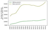
Let's see how it looks on a plot:
plt = df_crimes1.plot(xticks=df_crimes1.index, color=['g', 'olive'])
plt.set_xticklabels(df_fenc_agg.index, rotation='vertical')
plt.set_xlabel('')
plt.set_ylabel('Number of offenses\nper 1 mln. within race')
Intermediate conclusions:
- Whites commit twice as many offenses as Blacks in absolute numbers, but three times as fewer in per capita numbers (per 1 million population within that race).
- Criminality among Whites grows more or less steadily over the entire period of investigation (doubled over 19 years). Criminality among Blacks also grows, but by leaps and starts, showing steep growth from 2001 to 2006, then abating slightly over 2007 — 2016 and plummeting again after 2017. Over the entire period, however, the growth factor is also 2, like with Whites.
- But for the period of decrease in 2007 — 2016, criminality among Blacks grows at a higher rate than that among Whites.
We can therefore answer our second question:
— Which race is statistically more prone to crime?
— Crimes committed by Blacks are three times more frequent than crimes committed by Whites.
Criminality and Lethal Force Fatalities
We've now come to the most important part. Let's see if we can answer the third question: Can one say the police kills in proportion to the number of crimes?
The question boils down to looking at the correlation between our two datasets — use of force data (from the FENC database) and crime data (from the FBI database).
We start by routinely merging the two datasets into one:
# glue together the FENC and CRIMES dataframes
df_uof_crimes = df_fenc_agg.join(df_crimes1, lsuffix='_uof', rsuffix='_cr')
# we won't need the first 2 columns (absolute FENC values), so get rid of them
df_uof_crimes = df_uof_crimes.loc[:, 'White_pop':'Black_promln_cr']
The resulting combined data:
White_pop
Black_pop
White_promln_uof
Black_promln_uof
White_promln_cr
Black_promln_cr
Year
2000
218756353
35410436
1.330247
4.179559
6115.058976
17697.409882
2001
219843871
35758783
1.605685
4.418495
6829.701429
20431.707645
2002
220931389
36107130
1.643044
4.458953
7282.333249
20972.838329
2003
222018906
36455476
1.747599
4.910099
7857.691182
22218.966500
2004
223106424
36803823
1.949742
4.265861
8826.576863
26308.815799
2005
224193942
37152170
2.016112
4.871855
9713.826255
30616.569637
2006
225281460
37500517
2.041890
5.653255
10252.894313
33189.382429
2007
226368978
37848864
1.983487
5.786171
10566.527362
34100.495064
2008
227456495
38197211
1.943229
5.576323
10580.520024
34052.276749
2009
228544013
38545558
2.091501
6.459888
10889.263592
33954.651792
2010
229397472
38874625
2.205778
5.633495
10977.017218
33884.236826
2011
230838975
39189528
2.499578
7.399936
11035.346176
32946.454471
2012
231992377
39623138
2.724227
7.621809
11562.836825
33150.706035
2013
232969901
39919371
2.974633
7.765653
11211.113491
32207.571607
2014
233963128
40379066
3.009021
6.538041
11227.354594
31517.346141
2015
234940100
40695277
3.102919
6.683822
11564.786088
31764.865490
2016
234644039
40893369
3.081263
6.578084
12193.026562
33186.064958
2017
235507457
41393491
3.154889
6.401973
12656.261666
34900.390499
2018
236173020
41617764
3.281493
6.367473
13180.171893
37805.202605
Let me refresh you memory on the individual columns here:
- White_pop — White population
- Black_pop — Black population
- White_promln_uof — White lethal force victims per 1 million Whites
- Black_promln_uof — Black lethal force victims per 1 million Blacks
- White_promln_cr — Number of crimes committed by Whites per 1 million Whites
- Black_promln_cr — Number of crimes committed by Blacks per 1 million Blacks
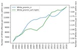
We next want to see how the police victim and crime curves compare on one plot. For Whites:
plt = df_uof_crimes['White_promln_cr'].plot(xticks=df_uof_crimes.index, legend=True)
plt.set_ylabel('Number of White offenses per 1 mln. within race')
plt2 = df_uof_crimes['White_promln_uof'].plot(xticks=df_uof_crimes.index, legend=True, secondary_y=True, style='g')
plt2.set_ylabel('Number of White UOF victims per 1 mln. within race', rotation=90)
plt2.set_xlabel('')
plt.set_xlabel('')
plt.set_xticklabels(df_uof_crimes.index, rotation='vertical')
The same on a scatter plot:
plt = df_uof_crimes.plot.scatter(x='White_promln_cr', y='White_promln_uof')
plt.set_xlabel('Number of White offenses per 1 mln. within race')
plt.set_ylabel('Number of White UOF victims per 1 mln. within race')

A quick look at the graphs shows that some correlation is present. OK, now for Blacks:
plt = df_uof_crimes['Black_promln_cr'].plot(xticks=df_uof_crimes.index, legend=True)
plt.set_ylabel('Number of Black offenses per 1 mln. within race')
plt2 = df_uof_crimes['Black_promln_uof'].plot(xticks=df_uof_crimes.index, legend=True, secondary_y=True, style='g')
plt2.set_ylabel('Number of Black UOF victims per 1 mln. within race', rotation=90)
plt2.set_xlabel('')
plt.set_xlabel('')
plt.set_xticklabels(df_uof_crimes.index, rotation='vertical')

And on a scatter plot:
plt = df_uof_crimes.plot.scatter(x='Black_promln_cr', y='Black_promln_uof')
plt.set_xlabel('Number of Black offenses per 1 mln. within race')
plt.set_ylabel('Number of Black UOF victims per 1 mln. within race')
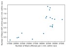
Things are much worse here: the two trends duck and bob a lot, though the principle correlation is still visible, the proportion is positive, if non-linear.
We will make use of statistical methods to quantify these correlations, making correlation matrices estimated with the Pearson correlation coefficient:
df_corr = df_uof_crimes.loc[:, ['White_promln_cr', 'White_promln_uof',
'Black_promln_cr', 'Black_promln_uof']].corr(method='pearson')
df_corr.style.background_gradient(cmap='PuBu')
We get this table:
White_promln_cr
White_promln_uof
Black_promln_cr
Black_promln_uof
White_promln_cr
1.000000
0.885470
0.949909
0.802529
White_promln_uof
0.885470
1.000000
0.710052
0.795486
Black_promln_cr
0.949909
0.710052
1.000000
0.722170
Black_promln_uof
0.802529
0.795486
0.722170
1.000000
The correlation coefficients for both races are in bold: it is 0.885 for Whites and 0.722 for Blacks. Thus a positive correlation between lethal force victims and criminality is observed for both races, but it is more prominent for Whites (probably significant) and nears non-significant for Blacks. The latter result is, of course, due to the higher data heterogeneity (scatter) for Black crimes and police victims.
As a final step, let's try to estimate the probability of Black and White offenders to get shot by the police. We have no direct ways to do that, since we don't have information on the criminality of the lethal force victims (who of them was found to be an offender and who was judicially clear). So we can only take the easy path and divide the per capita victim counts by the per capita crime counts for each race and multiply by 100 to show percentage values.
# let's look at the aggregate data (with individual year observations collapsed)
df_uof_crimes_agg = df_uof_crimes.loc[:, ['White_promln_cr', 'White_promln_uof',
'Black_promln_cr', 'Black_promln_uof']].agg(['mean', 'sum', 'min', 'max'])
# now calculate the percentage of fatal encounters from the total crime count in each race
df_uof_crimes_agg['White_uof_cr'] = df_uof_crimes_agg['White_promln_uof'] * 100. /
df_uof_crimes_agg['White_promln_cr']
df_uof_crimes_agg['Black_uof_cr'] = df_uof_crimes_agg['Black_promln_uof'] * 100. /
df_uof_crimes_agg['Black_promln_cr']
We get this table:
White_promln_cr
White_promln_uof
Black_promln_cr
Black_promln_uof
White_uof_cr
Black_uof_cr
mean
10238.016198
2.336123
30258.208024
5.872145
0.022818
0.019407
sum
194522.307758
44.386338
574905.952459
111.570747
0.022818
0.019407
min
6115.058976
1.330247
17697.409882
4.179559
0.021754
0.023617
max
13180.171893
3.281493
37805.202605
7.765653
0.024897
0.020541
Let's show the means (in bold above) as a bar chart:
plt = df_uof_crimes_agg.loc['mean', ['White_uof_cr', 'Black_uof_cr']].plot.bar(color=['g', 'olive'])
plt.set_ylabel('Ratio of UOF victims to offense count')
plt.set_xticklabels(['White', 'Black'], rotation=0)
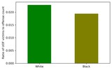
Looking at this chart, you can see that the probability of a White offender to be shot dead by the police is somewhat higher than that of a Black offender. This estimate is certainly quite tentative, but it can give at least some idea.
Intermediate conclusions:
- Fatal encounters with law enforcement are connected with criminality (number of offenses committed). The correlation though differs between the two races: for Whites, it is almost perfect, for Blacks — far from perfect.
- Looking at the combined police victim / crime charts, it becomes obvious that lethal force victims grow 'in reply to' criminality growth, generally with a few years' lag (this is more conspicuous in the Black data). This phenomenon chimes in with the reasonable notion that the authorities 'react' on criminality (more crimes > more impunity > more closeups with law enforcement > more lethal outcomes).
- White offenders tend to meet death from the police more frequently than Black offenders, although the difference is almost negligible.
Finally, the answer to our third question:
— Can one say the police kills in proportion to the number of crimes?
— Yes, this proportion can be observed, though different between the two races: for Whites, it is almost perfect, for Blacks — far from perfect.
In the next (and final) part of the narrative, we will look into the geographical distribution of the analyzed data across the states.
===========
Источник:
habr.com
===========
===========
Автор оригинала: S0mbre
===========Похожие новости:
- [Open source, Python, Data Mining] Crime, Race and Lethal Force in the USA — Part 1 (перевод)
- [Python, Анализ и проектирование систем] Многоканальные массовые рассылки на Redis
- [IT-эмиграция, Карьера в IT-индустрии] [Личный опыт] Как специалисту по Data Science с тремя годами опыта устроиться в Google и переехать в Лондон
- [Python, XML] Модуль для работы с XML файлами
- [Python, API] Чертыре способа получить аудио вк или «это не баг, а фича»
- [Информационная безопасность, Open source, Go, DevOps] Легкая работа со сложными алертами. Или история создания Balerter
- [IT-инфраструктура, Open source, Конференции, Системное администрирование] Онлайн митап Zabbix и сессия вопросов/ответов с Алексеем Владышевым
- [Open source, Системное администрирование, Виртуализация, Разработка под Linux] Разработка и тестирование Ansible-ролей с использованием Molecule и Podman
- [Биотехнологии, Искусственный интеллект] Можно ли воссоздать полную нейросеть мыши из тонких послойных разрезов мозга?
- [Java, Open source, Анализ и проектирование систем, Программирование] Добавляем ORM в проект за четыре шага
Теги для поиска: #_big_data, #_data_mining, #_open_source, #_python, #_python, #_pandas, #_data_science, #_open_source, #_big_data, #_statistics, #_black_lives_matter, #_usa, #_police, #_research, #_big_data, #_data_mining, #_open_source, #_python
Вы не можете начинать темы
Вы не можете отвечать на сообщения
Вы не можете редактировать свои сообщения
Вы не можете удалять свои сообщения
Вы не можете голосовать в опросах
Вы не можете прикреплять файлы к сообщениям
Вы не можете скачивать файлы
Текущее время: 14-Янв 20:17
Часовой пояс: UTC + 5
| Автор | Сообщение |
|---|---|
|
news_bot ®
Стаж: 7 лет 11 месяцев |
|
 In the previous part of this article, I talked about the research background, goals, assumptions, source data, and used tools. Today, without further ado, let's say together… Chocks Away! We start by importing the required packages and defining the root folder where the source data sit: import pandas as pd, numpy as np
# root folder path (change for your own!) ROOT_FOLDER = r'c:\_PROG_\Projects\us_crimes' Lethal Force Fatalities First let's look into the use of lethal force data. Load the CSV into a new DataFrame: # FENC source CSV
FENC_FILE = ROOT_FOLDER + '\\fatal_enc_db.csv' # read to DataFrame df_fenc = pd.read_csv(FENC_FILE, sep=';', header=0, usecols=["Date (Year)", "Subject's race with imputations", "Cause of death", "Intentional Use of Force (Developing)", "Location of death (state)"]) You will note that not all the fields are loaded, but only those we'll need in the research: year, victim race (with imputations), cause of death (not used now but may come in useful later on), intentional use of force flag, and the state where the death took place. It's worth understanding what «subject's race with imputations» means. The fact is, the official / media sources that FENC uses to glean data don't always report the victim's race, resulting in data gaps. To compensate these gaps, the FENC community involves third-party experts who estimate the race by the other available data (with some degree of error). You can read more on this on the FENC website or see notes in the original Excel spreadsheet (sheet 2). We'll then give the columns handier titles and drop the rows with missing data: df_fenc.columns = ['Race', 'State', 'Cause', 'UOF', 'Year']
df_fenc.dropna(inplace=True) Now we hava to unify the race categories with those used in the crime and population datasets we are going to match with, since these datasets use somewhat different racial classifications. The FENC database, for one, singles out the Hispanic/Latino ethnicity, as well as Asian/Pacific Islanders and Middle Easterns. But in this research, we're focusing on Blacks and Whites only. So we must make some aggregation / renaming: df_fenc = df_fenc.replace({'Race': {'European-American/White': 'White',
'African-American/Black': 'Black', 'Hispanic/Latino': 'White', 'Native American/Alaskan': 'American Indian', 'Asian/Pacific Islander': 'Asian', 'Middle Eastern': 'Asian', 'NA': 'Unknown', 'Race unspecified': 'Unknown'}}, value=None) We are leaving only White (now including Hispanic/Latino) and Black victims: df_fenc = df_fenc.loc[df_fenc['Race'].isin(['White', 'Black'])]
What's the purpose of the UOF (Use Of Force) field? For this research, we want to analyze only those cases when the police (or other law enforcement agencies) intentionally used lethal force. We leave out cases when the death was the result of suicide (for example, when sieged by the police) or pursuit and crash in a vehicle. This constraint follows from two criteria: 1) the circumstances of deaths not directly resulting from use of force don't normally allow of a transparent cause-and-effect link between the acts of the law enforcement officers and the ensuing death (one example could be when a man dies from a heart attack when held at gun-point by a police officer; another common example is when a suspect being arrested shoots him/herself in the head); 2) it is only intentional use of force that counts in official statistics; thus, for instance, the future FBI database I mentioned in the previous part of the article will collect only such cases. So to leave only intentional use of force cases: df_fenc = df_fenc.loc[df_fenc['UOF'].isin(['Deadly force', 'Intentional use of force'])]
For convenience we'll add the full state names. I made a separate CSV file for that purpose, which we're now merging with our data: df_state_names = pd.read_csv(ROOT_FOLDER + '\\us_states.csv', sep=';', header=0)
df_fenc = df_fenc.merge(df_state_names, how='inner', left_on='State', right_on='state_abbr') Type df_fenc.head() to peek at the resulting dataset: Race State Cause UOF Year state_name state_abbr 0 Black GA Gunshot Deadly force 2000 Georgia GA 1 Black GA Gunshot Deadly force 2000 Georgia GA 2 Black GA Gunshot Deadly force 2000 Georgia GA 3 Black GA Gunshot Deadly force 2000 Georgia GA 4 Black GA Gunshot Deadly force 2000 Georgia GA Since we're not going to investigate the individual cases, let's aggregate the data by years and victim races: # group by year and race
ds_fenc_agg = df_fenc.groupby(['Year', 'Race']).count()['Cause'] df_fenc_agg = ds_fenc_agg.unstack(level=1) # cast numericals to UINT16 to save memory df_fenc_agg = df_fenc_agg.astype('uint16') The resulting table is indexed by years (2000 — 2020) and contains two columns: 'White' (number of white victims) and 'Black' (number of black victims). Let's take a look at the corresponding plot: plt = df_fenc_agg.plot(xticks=df_fenc_agg.index, color=['olive', 'g'])
plt.set_xticklabels(df_fenc_agg.index, rotation='vertical') plt.set_xlabel('') plt.set_ylabel('Number of police victims') plt  Intermediate conclusion: White police victims outnumber black victims in absolute figures.
The average difference factor between the two is about 2.4. It's not a far guess that this is due to the difference between the population of the two races in the US. Well, let's look at per capita values then. Load the population data: # population CSV file (1991 - 2018 data points)
POP_FILE = ROOT_FOLDER + '\\us_pop_1991-2018.csv' df_pop = pd.read_csv(POP_FILE, index_col=0, dtype='int64') Then merge the data with our dataset: # take only Black and White population for 2000 - 2018
df_pop = df_pop.loc[2000:2018, ['White_pop', 'Black_pop']] # join dataframes and drop rows with missing values df_fenc_agg = df_fenc_agg.join(df_pop) df_fenc_agg.dropna(inplace=True) # cast population numbers to integer type df_fenc_agg = df_fenc_agg.astype({'White_pop': 'uint32', 'Black_pop': 'uint32'}) OK. Finally, create two new columns with per capita (per million) values dividing the abosulte victim counts by the respective race population and multiplying by one million: df_fenc_agg['White_promln'] = df_fenc_agg['White'] * 1e6 / df_fenc_agg['White_pop']
df_fenc_agg['Black_promln'] = df_fenc_agg['Black'] * 1e6 / df_fenc_agg['Black_pop'] Let's see what we get: Black White White_pop Black_pop White_promln Black_promln Year 2000 148 291 218756353 35410436 1.330247 4.179559 2001 158 353 219843871 35758783 1.605685 4.418495 2002 161 363 220931389 36107130 1.643044 4.458953 2003 179 388 222018906 36455476 1.747599 4.910099 2004 157 435 223106424 36803823 1.949742 4.265861 2005 181 452 224193942 37152170 2.016112 4.871855 2006 212 460 225281460 37500517 2.041890 5.653255 2007 219 449 226368978 37848864 1.983487 5.786171 2008 213 442 227456495 38197211 1.943229 5.576323 2009 249 478 228544013 38545558 2.091501 6.459888 2010 219 506 229397472 38874625 2.205778 5.633495 2011 290 577 230838975 39189528 2.499578 7.399936 2012 302 632 231992377 39623138 2.724227 7.621809 2013 310 693 232969901 39919371 2.974633 7.765653 2014 264 704 233963128 40379066 3.009021 6.538041 2015 272 729 234940100 40695277 3.102919 6.683822 2016 269 723 234644039 40893369 3.081263 6.578084 2017 265 743 235507457 41393491 3.154889 6.401973 2018 265 775 236173020 41617764 3.281493 6.367473 The two rightmost columns now contain per million victim counts for both races. Time to visualize that: plt = df_fenc_agg.loc[:, ['White_promln', 'Black_promln']].plot(xticks=df_fenc_agg.index, color=['g', 'olive'])
plt.set_xticklabels(df_fenc_agg.index, rotation='vertical') plt.set_xlabel('') plt.set_ylabel('Number of police victims\nper 1 mln. within race') plt  We'll also display the basic stats for this data by running: df_fenc_agg.loc[:, ['White_promln', 'Black_promln']].describe()
White_promln Black_promln count 19.000000 19.000000 mean 2.336123 5.872145 std 0.615133 1.133677 min 1.330247 4.179559 25% 1.946485 4.890977 50% 2.091501 5.786171 75% 2.991827 6.558062 max 3.281493 7.765653 Intermediate conclusions:
Thus, we can answer our first question: — Can one say the police kill Blacks more frequently than Whites? — Yes, it is a correct inference. Blacks are 2.6 times more likely to meet death by the hands of law enforcement agencies than Whites. Bearing in mind this inference, let's go ahead and look at the crime data to see if (and how) they are related to lethal force fatalities and races. Crime Data Let's load our crime CSV: CRIMES_FILE = ROOT_FOLDER + '\\culprits_victims.csv'
df_crimes = pd.read_csv(CRIMES_FILE, sep=';', header=0, index_col=0, usecols=['Year', 'Offense', 'Offender/Victim', 'White', 'White pro capita', 'Black', 'Black pro capita']) Again, as before, we're using only the relevant fields: year, offense type, offender / victim classifier and offense counts for each race (absolute — 'White', 'Black' and per capita — 'White pro capita', 'Black pro capita'). Let's look what we have here (with df_crimes.head()): Offense Offender/Victim Black White Black pro capita White pro capita Year 1991 All Offenses Offender 490 598 1.518188e-05 2.861673e-06 1991 All Offenses Offender 4 4 1.239337e-07 1.914160e-08 1991 All Offenses Offender 508 122 1.573958e-05 5.838195e-07 1991 All Offenses Offender 155 176 4.802432e-06 8.422314e-07 1991 All Offenses Offender 13 19 4.027846e-07 9.092270e-08 We won't need data on offense victims so far, so get rid of them: # leave only offenders
df_crimes1 = df_crimes.loc[df_crimes['Offender/Victim'] == 'Offender'] # leave only 2000 - 2018 data years and remove redundant columns df_crimes1 = df_crimes1.loc[2000:2018, ['Offense', 'White', 'White pro capita', 'Black', 'Black pro capita']] Here's the resulting dataset (1295 rows * 5 columns): Offense White White pro capita Black Black pro capita Year 2000 All Offenses 679 0.000003 651 0.000018 2000 All Offenses 11458 0.000052 30199 0.000853 2000 All Offenses 4439 0.000020 3188 0.000090 2000 All Offenses 10481 0.000048 5153 0.000146 2000 All Offenses 746 0.000003 63 0.000002 ... ... ... ... ... ... 2018 Larceny Theft Offenses 1961 0.000008 1669 0.000040 2018 Larceny Theft Offenses 48616 0.000206 30048 0.000722 2018 Drugs Narcotic Offenses 555974 0.002354 223398 0.005368 2018 Drugs Narcotic Offenses 305052 0.001292 63785 0.001533 2018 Weapon Law Violation 70034 0.000297 58353 0.001402 Now we need to convert the per capita (per 1 person) values to per million values (in keeping with the unit data we use throughout the research). Just multiply the per capita columns by one million: df_crimes1['White_promln'] = df_crimes1['White pro capita'] * 1e6
df_crimes1['Black_promln'] = df_crimes1['Black pro capita'] * 1e6 To see the whole picture — how crimes committed by Whites and Blacks are distributed across the offense types, let's aggregate the absolute crime counts by years: df_crimes_agg = df_crimes1.groupby(['Offense']).sum().loc[:, ['White', 'Black']]
White Black Offense All Offenses 44594795 22323144 Assault Offenses 12475830 7462272 Drugs Narcotic Offenses 9624596 3453140 Larceny Theft Offenses 9563917 4202235 Murder And Nonnegligent Manslaughter 28913 39617 Sex Offenses 833088 319366 Weapon Law Violation 829485 678861 Or in a graph: plt = df_crimes_agg.plot.barh(color=['g', 'olive'])
plt.set_ylabel('') plt.set_xlabel('Number of offenses (sum for 2000-2018)')  We can observe here that:
Again we realize that no robust conclusions can be made about 'race criminality' without population data. So we're looking at per capita (per million) values: df_crimes_agg1 = df_crimes1.groupby(['Offense']).sum().loc[:, ['White_promln', 'Black_promln']]
White_promln Black_promln Offense All Offenses 194522.307758 574905.952459 Assault Offenses 54513.398833 192454.602875 Drugs Narcotic Offenses 41845.758869 88575.523095 Larceny Theft Offenses 41697.303725 108189.184125 Murder And Nonnegligent Manslaughter 125.943007 1016.403706 Sex Offenses 3633.777035 8225.144985 Weapon Law Violation 3612.671402 17389.163849 Or as a graph: plt = df_crimes_agg1.plot.barh(color=['g', 'olive'])
plt.set_ylabel('') plt.set_xlabel('Number of offenses (sum for 2000-2018) per 1 mln. within race')  We've got quite a different picture this time. Blacks commit more crimes for each analyzed category than Whites, approaching a triple difference for 'All Offenses'. We will now leave only the 'All Offenses' category as the most representative of the 7 and sum up the rows by years (since the source data may feature several entries per year, matching the number of reporting agencies). # leave only 'All Offenses' category
df_crimes1 = df_crimes1.loc[df_crimes1['Offense'] == 'All Offenses'] # could also have left assault and murder (try as experiment!) #df_crimes1 = df_crimes1.loc[df_crimes1['Offense'].str.contains('Assault|Murder')] # drop absolute columns and aggregate data by years df_crimes1 = df_crimes1.groupby(level=0).sum().loc[:, ['White_promln', 'Black_promln']] The resulting dataset: White_promln Black_promln Year 2000 6115.058976 17697.409882 2001 6829.701429 20431.707645 2002 7282.333249 20972.838329 2003 7857.691182 22218.966500 2004 8826.576863 26308.815799 2005 9713.826255 30616.569637 2006 10252.894313 33189.382429 2007 10566.527362 34100.495064 2008 10580.520024 34052.276749 2009 10889.263592 33954.651792 2010 10977.017218 33884.236826 2011 11035.346176 32946.454471 2012 11562.836825 33150.706035 2013 11211.113491 32207.571607 2014 11227.354594 31517.346141 2015 11564.786088 31764.865490 2016 12193.026562 33186.064958 2017 12656.261666 34900.390499 2018 13180.171893 37805.202605 Let's see how it looks on a plot: plt = df_crimes1.plot(xticks=df_crimes1.index, color=['g', 'olive'])
plt.set_xticklabels(df_fenc_agg.index, rotation='vertical') plt.set_xlabel('') plt.set_ylabel('Number of offenses\nper 1 mln. within race')  Intermediate conclusions:
We can therefore answer our second question: — Which race is statistically more prone to crime? — Crimes committed by Blacks are three times more frequent than crimes committed by Whites. Criminality and Lethal Force Fatalities We've now come to the most important part. Let's see if we can answer the third question: Can one say the police kills in proportion to the number of crimes? The question boils down to looking at the correlation between our two datasets — use of force data (from the FENC database) and crime data (from the FBI database). We start by routinely merging the two datasets into one: # glue together the FENC and CRIMES dataframes
df_uof_crimes = df_fenc_agg.join(df_crimes1, lsuffix='_uof', rsuffix='_cr') # we won't need the first 2 columns (absolute FENC values), so get rid of them df_uof_crimes = df_uof_crimes.loc[:, 'White_pop':'Black_promln_cr'] The resulting combined data: White_pop Black_pop White_promln_uof Black_promln_uof White_promln_cr Black_promln_cr Year 2000 218756353 35410436 1.330247 4.179559 6115.058976 17697.409882 2001 219843871 35758783 1.605685 4.418495 6829.701429 20431.707645 2002 220931389 36107130 1.643044 4.458953 7282.333249 20972.838329 2003 222018906 36455476 1.747599 4.910099 7857.691182 22218.966500 2004 223106424 36803823 1.949742 4.265861 8826.576863 26308.815799 2005 224193942 37152170 2.016112 4.871855 9713.826255 30616.569637 2006 225281460 37500517 2.041890 5.653255 10252.894313 33189.382429 2007 226368978 37848864 1.983487 5.786171 10566.527362 34100.495064 2008 227456495 38197211 1.943229 5.576323 10580.520024 34052.276749 2009 228544013 38545558 2.091501 6.459888 10889.263592 33954.651792 2010 229397472 38874625 2.205778 5.633495 10977.017218 33884.236826 2011 230838975 39189528 2.499578 7.399936 11035.346176 32946.454471 2012 231992377 39623138 2.724227 7.621809 11562.836825 33150.706035 2013 232969901 39919371 2.974633 7.765653 11211.113491 32207.571607 2014 233963128 40379066 3.009021 6.538041 11227.354594 31517.346141 2015 234940100 40695277 3.102919 6.683822 11564.786088 31764.865490 2016 234644039 40893369 3.081263 6.578084 12193.026562 33186.064958 2017 235507457 41393491 3.154889 6.401973 12656.261666 34900.390499 2018 236173020 41617764 3.281493 6.367473 13180.171893 37805.202605 Let me refresh you memory on the individual columns here:
We next want to see how the police victim and crime curves compare on one plot. For Whites: plt = df_uof_crimes['White_promln_cr'].plot(xticks=df_uof_crimes.index, legend=True)
plt.set_ylabel('Number of White offenses per 1 mln. within race') plt2 = df_uof_crimes['White_promln_uof'].plot(xticks=df_uof_crimes.index, legend=True, secondary_y=True, style='g') plt2.set_ylabel('Number of White UOF victims per 1 mln. within race', rotation=90) plt2.set_xlabel('') plt.set_xlabel('') plt.set_xticklabels(df_uof_crimes.index, rotation='vertical')  The same on a scatter plot: plt = df_uof_crimes.plot.scatter(x='White_promln_cr', y='White_promln_uof')
plt.set_xlabel('Number of White offenses per 1 mln. within race') plt.set_ylabel('Number of White UOF victims per 1 mln. within race')  A quick look at the graphs shows that some correlation is present. OK, now for Blacks: plt = df_uof_crimes['Black_promln_cr'].plot(xticks=df_uof_crimes.index, legend=True)
plt.set_ylabel('Number of Black offenses per 1 mln. within race') plt2 = df_uof_crimes['Black_promln_uof'].plot(xticks=df_uof_crimes.index, legend=True, secondary_y=True, style='g') plt2.set_ylabel('Number of Black UOF victims per 1 mln. within race', rotation=90) plt2.set_xlabel('') plt.set_xlabel('') plt.set_xticklabels(df_uof_crimes.index, rotation='vertical')  And on a scatter plot: plt = df_uof_crimes.plot.scatter(x='Black_promln_cr', y='Black_promln_uof')
plt.set_xlabel('Number of Black offenses per 1 mln. within race') plt.set_ylabel('Number of Black UOF victims per 1 mln. within race')  Things are much worse here: the two trends duck and bob a lot, though the principle correlation is still visible, the proportion is positive, if non-linear. We will make use of statistical methods to quantify these correlations, making correlation matrices estimated with the Pearson correlation coefficient: df_corr = df_uof_crimes.loc[:, ['White_promln_cr', 'White_promln_uof',
'Black_promln_cr', 'Black_promln_uof']].corr(method='pearson') df_corr.style.background_gradient(cmap='PuBu') We get this table: White_promln_cr White_promln_uof Black_promln_cr Black_promln_uof White_promln_cr 1.000000 0.885470 0.949909 0.802529 White_promln_uof 0.885470 1.000000 0.710052 0.795486 Black_promln_cr 0.949909 0.710052 1.000000 0.722170 Black_promln_uof 0.802529 0.795486 0.722170 1.000000 The correlation coefficients for both races are in bold: it is 0.885 for Whites and 0.722 for Blacks. Thus a positive correlation between lethal force victims and criminality is observed for both races, but it is more prominent for Whites (probably significant) and nears non-significant for Blacks. The latter result is, of course, due to the higher data heterogeneity (scatter) for Black crimes and police victims. As a final step, let's try to estimate the probability of Black and White offenders to get shot by the police. We have no direct ways to do that, since we don't have information on the criminality of the lethal force victims (who of them was found to be an offender and who was judicially clear). So we can only take the easy path and divide the per capita victim counts by the per capita crime counts for each race and multiply by 100 to show percentage values. # let's look at the aggregate data (with individual year observations collapsed)
df_uof_crimes_agg = df_uof_crimes.loc[:, ['White_promln_cr', 'White_promln_uof', 'Black_promln_cr', 'Black_promln_uof']].agg(['mean', 'sum', 'min', 'max']) # now calculate the percentage of fatal encounters from the total crime count in each race df_uof_crimes_agg['White_uof_cr'] = df_uof_crimes_agg['White_promln_uof'] * 100. / df_uof_crimes_agg['White_promln_cr'] df_uof_crimes_agg['Black_uof_cr'] = df_uof_crimes_agg['Black_promln_uof'] * 100. / df_uof_crimes_agg['Black_promln_cr'] We get this table: White_promln_cr White_promln_uof Black_promln_cr Black_promln_uof White_uof_cr Black_uof_cr mean 10238.016198 2.336123 30258.208024 5.872145 0.022818 0.019407 sum 194522.307758 44.386338 574905.952459 111.570747 0.022818 0.019407 min 6115.058976 1.330247 17697.409882 4.179559 0.021754 0.023617 max 13180.171893 3.281493 37805.202605 7.765653 0.024897 0.020541 Let's show the means (in bold above) as a bar chart: plt = df_uof_crimes_agg.loc['mean', ['White_uof_cr', 'Black_uof_cr']].plot.bar(color=['g', 'olive'])
plt.set_ylabel('Ratio of UOF victims to offense count') plt.set_xticklabels(['White', 'Black'], rotation=0)  Looking at this chart, you can see that the probability of a White offender to be shot dead by the police is somewhat higher than that of a Black offender. This estimate is certainly quite tentative, but it can give at least some idea. Intermediate conclusions:
Finally, the answer to our third question: — Can one say the police kills in proportion to the number of crimes? — Yes, this proportion can be observed, though different between the two races: for Whites, it is almost perfect, for Blacks — far from perfect. In the next (and final) part of the narrative, we will look into the geographical distribution of the analyzed data across the states. =========== Источник: habr.com =========== =========== Автор оригинала: S0mbre ===========Похожие новости:
|
|
Вы не можете начинать темы
Вы не можете отвечать на сообщения
Вы не можете редактировать свои сообщения
Вы не можете удалять свои сообщения
Вы не можете голосовать в опросах
Вы не можете прикреплять файлы к сообщениям
Вы не можете скачивать файлы
Вы не можете отвечать на сообщения
Вы не можете редактировать свои сообщения
Вы не можете удалять свои сообщения
Вы не можете голосовать в опросах
Вы не можете прикреплять файлы к сообщениям
Вы не можете скачивать файлы
Текущее время: 14-Янв 20:17
Часовой пояс: UTC + 5
